Reports
The aging feature lets you group data by age. For example, say you want to know how many messages sent in the past few weeks have been delivered, and you want to see the totals grouped by the first week, second week, and so on. You can do this by applying aging to a bar, column, pie, line or table widget. To do this, you'll likely need to create a custom report because standard reports may not be set up with the necessary fields and filters.
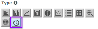
You select this icon in the widget editor to display the aging widget properties:
Example aging widget
This sample aging widget shows the number of messages sent during the first three weeks of one month. The data series you're looking at here is Messages Delivered, and you’ll want to look at this data for a one-month period.

How to build it
In the procedures below, we will create the example widget shown above. We'll base the widget on a custom report that contains these fields:
- Day of Accepted Date
- Sum of Messages Accepted
- Sum of Messages Delivered
- Sum of Messages Failed
The report also contains the filter, Accepted Date, which is set to Predefined / This Month.
The steps assume you've already created a dashboard to hold the widget.
Set required properties
-
From your dashboard, select Add Widget and then select Custom.
This displays the Add Custom Widget pop-up, which lets you create widgets based on the reports available to you.

- Select the plus sign (+) next to the report you want to use for the widget. You can add multiple widgets to the dashboard at once, but in this example we're going to add just one.
-
Select Done.
Since we added just one widget, the Edit Widget page displays next. If we had added multiple widgets, then we would be returned to the dashboard and the widgets would be added in the default List style.
-
Under Properties and Type, select the aging widget.
Note that the widget inherits the name of the report you based it on. You can change this if you like. The name will eventually display in the upper left. This can function as the only name for the widget or you can also give the widget a title. See step 1 under "Set Optional Properties".
-
For Style, select column, bar, line, pie, or table. For our example we'll select column.

- For Date Column, select the field from the report that contains the data you want represented in the bins. For our example we'll select Day of Accepted Date.
- For Time Units, select Day, Week, Month or Year. This is the unit of time that a bin will represent.
-
For Bin Ranges, we'll be adding four bins. First enter the number representing the starting bin value and click the + sign. For our example we'll first enter 1.
The table displays 0 for Start and 1 for End. This defines the time period (the first week) for the first bin.
Enter 2 and click + to add another time period (the second week) to the chart.
Enter 3 and click + to add the third bin.
Enter 4 and click + to add the fourth bin.
For our example, because we're looking back on the month, we won't check Include Future Date Values.
-
For Frequency Type specify one of the following.
- Sum of Aggregate Column — Your chart will display the sum of the aggregate column for the date range you specified. If you select this then in step 10 you will specify the aggregate column to use.
- Count of Series Column(s) — Your chart will display the number of different column values for the date range you specified. If you select this then in step 10 you will specify the series column(s) to use.
-
For Aggregate Column, specify which aggregate column from the report to use:
- Sum of Messages Accepted
- Sum of Messages Delivered
- Sum of Messages Failed


Set optional properties
- Give your widget a Title. This will display in the center of the widget. We'll call our example, Messages Accepted / Delivered by Originator.
- Specify whether the widget will span the Full width of the page or Half width.
- Apply a Color Theme to the chart.
- Specify whether the widget will be Regular height or Double height. (Double height won't be visible if you select half width.)
- Specify which Report Instance to use. By default this is set to Most Recent, meaning the data displayed by the widget is based on the most recent run of the report.
Once you click Save, you will be returned to the dashboard and your widget will display at the bottom. You can drag it to another position on the dashboard or move it to another dashboard if you wish.
Finished widget