Reports
Line widgets are useful when you want to see the relationship between two sets of values. In contrast to bars and columns, which work well to represent individual values, lines are effective at communicating continuity and flow from one value to the next. Since the line connects individual values you can easily see changes over time. The data points in a line chart are based on either one or more aggregate columns in the report, or on a specific column.
Here are some possible uses of a line chart:
- To see the number of successful versus failed messages over a specific period
- To compare MT versus MO message volume over a specific time interval
- To look at the occurrence of certain response codes
When you are working with a range of values that vary widely or mixed types of data, you might want to use the line/column style. This lets you assign a line to one data series and a column to another.
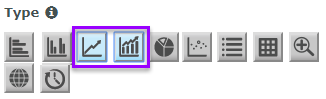
You select these icons in the widget editor to display the line or line/column chart properties:
Example line chart widgets
This simple line widget shows the total message traffic over a six-day period. You can easily get a sense of message volume by looking at this chart, and also see when the heaviest traffic occurred and when it began to drop off.

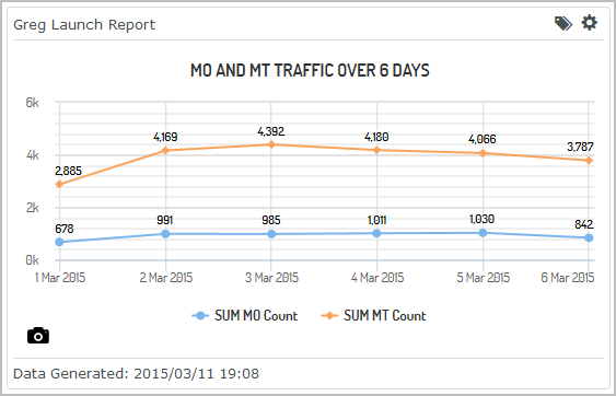
This sample shows two data series with the labels toggled on so that you can see actual values.
Setting up a custom line widget
Line/column widgets let you compare different sets of data. In the procedures below, we will create a line/column widget that compares failed messages against delivery receipt codes. This type of widget will give us a sense of which receipt codes We will base this widget on the report, SMS Monthly Summary Report - 13 Month. The steps assume you've already created a dashboard to hold the widget.
Set required properties
-
From your dashboard, select Add Widget and then select Custom.
This displays the Add Custom Widget pop-up, which lists the reports available to you.

- Select the plus sign (+) next to the report you want to use for the widget. You can add multiple widgets to the dashboard at once, but in this example we're going to add just one.
-
Select Done.
Since we added just one widget, the Edit Widget page displays next. If we had added multiple widgets, then we would be returned to the dashboard and the widgets would be added in the default List style.
-
To configure the widget, click the cog icon and select Edit.
The Edit Widget page displays.
- Under Properties and Type, select the line/column icon.
- For Column Series Data select Messages Failed. The columns in the widget will show the number of messages failed.
- For Line Series Data select Failure Rate. The line in the widget will show the rate of failed messages.
- For X-axis select Delivery Receipt Code.
- For Limit Number of ..., select whether you want to limit the data represented. For this example we'll accept the default, None. This means the

Set optional properties
- Give your widget a Title. This will display in the center of the widget.
- Specify whether the widget will span the Full width of the page or Half width.
- Specify whether the widget will be Regular height or Double height. (Double height won't be visible if you select half width.)
- Apply a specific Color Theme to the chart.
- Specify the Data Axis Scale. By default this is set to Linear.
- Specify which Report Instance to use. By default this is set to Most Recent, meaning the data displayed by the widget is based on the most recent run of the report.
Finished widget

Setting up a custom line/column widget
The following steps explain how to set up a custom line/column widget that displays the number of messages delivered over a one-month period. This widget is based on the report, SMS Monthly Summary Report - 13 Month. The steps assume you've already created a dashboard to hold the widget.
Set required properties
-
From your dashboard, select Add Widget and then select Custom.
This displays the Add Custom Widget pop-up, which lists the reports available to you.
- Select the plus sign (+) next to the report you want to use for the widget. You can add multiple widgets to the dashboard at once, but in this example we're going to add just one.
-
Select Done.
Since we added just one widget, the Edit Widget page displays next. If we had added multiple widgets, then we would be returned to the dashboard and the widgets would be added in the default List style.
- Under Properties and Type, select the line icon.
-
For Data Series select Values in aggregate column(s).
The page refreshes to display the properties relevant to aggregate data.
-
For Series Values, select Messages Delivered. This is the report column that will be represented by the line.

- For X-Axis, select the report column to use. For our example we'll select MONTH Accepted Date.
- For Limit Number of ..., select whether you want to limit the data represented.

Set optional properties
- Give your widget a Title. This will display in the center of the widget. We'll give our example the title, Failed Messages and Receipt Codes.
- Specify whether the widget will span the Full width of the page or Half width.
- Specify whether the widget will be Regular height or Double height. (Double height won't be visible if you select half width.)
- Apply a specific Color Theme to the chart.
- Specify the Data Axis Scale. By default this is set to Linear.
- Specify which Report Instance to use. By default this is set to Most Recent, meaning the data displayed by the widget is based on the most recent run of the report.
Finished widget
