Reports
Scatter chart widgets let you visualize the relationship between two paired sets of values. In a scatter chart, each data point is represented by a dot. One set of values is represented horizontally along the X axis and the other vertically along the Y axis. To interpret a scatter chart, you evaluate what happens to the Y axis value in relation to what happens to the X axis value. When X goes up, what does Y do, and vice versa. When the data points are close together and form a positive or negative linear pattern, then you can conclude that there's a strong relationship between the two sets of values.
For example, you might want to look at message success rate compared across destinations, or amongst different mobile operators, or using different originators. The number of messages with a DELIVERED status and, say, number of total messages sent via a particular long code represent two possible sets of values.
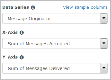
You select this icon in the widget editor to display the column or bar chart properties:
![]()
Example scatter chart widgets
The sample scatter widgets shown below show the relationship between messages accepted and messages delivered for two types of message originators: short codes and long codes.
Example scatter chart showing data for short codes

Example scatter chart showing data for long codes

How to build it
In the procedures below, we will create the example scatter widget shown above-left. We'll base the widget on the report, SMS Summary Report - Last Month. The steps assume you've already created a dashboard to hold the widget.
Set required properties
-
From your dashboard, select Add Widget and then select Custom.
This displays the Add Custom Widget pop-up, which lets you create widgets based on the reports available to you.

- Select the plus sign (+) next to the report you want to use for the widget. You can add multiple widgets to the dashboard at once, but in this example we're going to add just one.
-
Select Done.
Since we added just one widget, the Edit Widget page displays next. If we had added multiple widgets, then we would be returned to the dashboard and the widgets would be added in the default List style.
-
Under Properties and Type, select the scatter icon.
Note that the widget inherits the name of the report you based it on. You can change this if you like. The name will eventually display in the upper left. This can function as the only name for the widget or you can also give the widget a title. See step 1 under "Set Optional Properties".
-
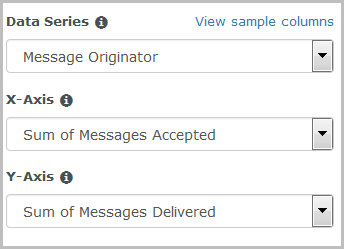
For Data Series, select the column containing the data you want to look at.
- For X-Axis, select the data set to be represented horizontally. For our example we'll select Sum of Messages Accepted.
- For Y-Axis, select the data set to be represented vertically. For our example we'll select Sum of Messages Delivered.

Set optional properties
- Give your widget a Title. This will display in the center of the widget. We'll call our example, Messages Accepted / Delivered by Originator.
- Specify whether the widget will span the Full width of the page or Half width.
- Apply a specific Color Theme to the chart.
- Choose a Data Axis Scale. For our example we'll choose Linear.
- Specify which Report Instance to use. By default this is set to Most Recent, meaning the data displayed by the widget is based on the most recent run of the report.
Once you click Save, you will be returned to the dashboard and your widget will display at the bottom. You can drag it to another position on the dashboard or move it to another dashboard if you wish.
Finished widget