Reports
Tables are good for displaying a large amount of data and detailed data. Let's say you want to look at message failure data. On a dashboard you could have a column chart showing summary-level data, and even have one or two levels of drill-down to get a feel for what's preventing messages from being delivered. In addition to that chart you could add a table widget to contain more information than can be displayed by the column chart.
You select this icon in the widget editor to display the map properties:
![]()
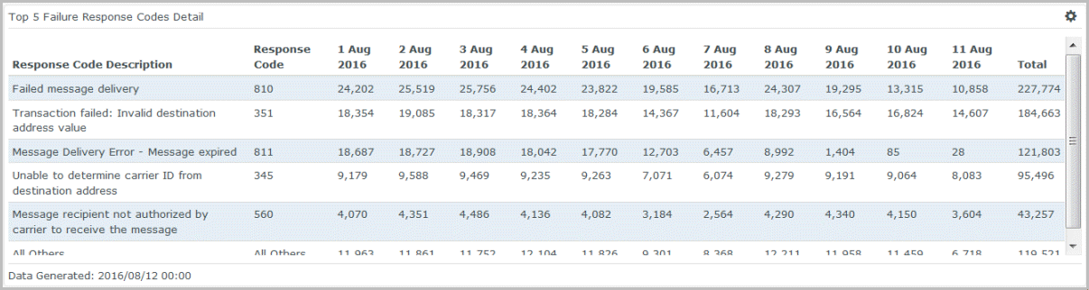
Example table widget
This table widget shows detailed information about response codes (a.k.a. delivery receipt codes), enabling you to understand not only how many messages are failing delivery, but also which error conditions are most prevalent. With this information you can work with OpenMarket to reduce certain conditions and increase message success rates.
How to build it
In the procedures below, we will create the widget shown above, which looks at response code rates by day. We'll base the widget on the report, SMS Daily Summary - This Month. The steps assume you've already created a dashboard to hold the widget.
Set required properties
-
From your dashboard, select Add Widget and then select Custom.
This displays the Add Custom Widget pop-up, which lets you create widgets based on the reports available to you.

- Select the plus sign (+) next to the report you want to use for the widget. You can add multiple widgets to the dashboard at once, but in this example we're going to add just one.
-
Select Done.
Since we added just one widget, the Edit Widget page displays next. If we had added multiple widgets, then we would be returned to the dashboard and the widgets would be added in the default List style.
-
Under Properties and Type, select the table icon.
Note that the widget inherits the name of the report you based it on. You can change this if you like. The widget name will eventually display in the upper left. This can function as the only name for the widget or you can also give the widget a title. See step 1 under "Set Optional Properties".
-
For Table Type, select from Time Series, Categories, and Cumulative. For our example we'll select Time Series.
- For Series Columns, select the data you want to look at (e.g., Success Rate, Messages Accepted, etc.). For our example we'll select Response Code and Response Code Description.
- For Aggregate Column, select the aggregate data you want to look at. For our example we'll select Messages Failed.
- For Include Row Total, select Yes to display the total for each row.
- For Date Column, select the type of date for which you want to look at the data. For our example we'll choose DAY Accepted Date.
- For Limit Number of ..., select whether you want to limit the data displayed. For our example we'll choose Top 5.

Set optional properties
- Choose either Full width or Half width.
- Choose either Regular height or Double height.
- Apply a specific Color Theme to the chart.
- Specify which Report Instance to use. By default this is set to Most Recent, meaning the data displayed by the widget is based on the most recent run of the report.
Once you click Save, you will be returned to the dashboard and your widget will display at the bottom. You can drag it to another position on the dashboard or move it to another dashboard if you wish.
Finished widget