Reports
Creating Widgets
Report data is easier to understand when it's represented visually through graphs like bar, column, and line charts. These and other kinds of graphs help you see patterns in the data, make comparisons, and derive meaning from the data more quickly than spreadsheets and complex tables.
Widgets enable you to graphically represent data from a specific report. For example, it's common to track the success and failure rates of messages. If you're sending messages internationally, you'll likely want to compare the success/failure rates by country and perhaps by mobile operator. Widgets enable you to view data like this in a graphical format that is quick to comprehend.
Three types of widgets
Like standard reports, the reason to use standard widgets is that they're quick to use. The disadvantage is that you cannot customize them beyond changing the width and color. Standard widgets are available only if your OpenMarket account manager has set up your account with standard reports, and your administrator has shared the standard reports with you.
If you want maximum flexibility to choose and format the data, then create a custom widget, or copy a standard widget and customize it.
Examples of widgets
Use standard and custom widgets to visualize data using various styles of charts. Bar and column charts are useful for comparing data, line charts for identifying trends, and pie charts for seeing how parts relate to the whole. Certain widgets support features such as drill-down and aging.
Use the text widget to add text to the dashboard. For example you can use a text widget as a divider on your dashboard.

Tips for working with widgets
- Widgets reside on dashboards, so you always create the dashboard first and then the widgets.
- Each widget is based on a specific standard or custom report. In order to use a standard widget, you must have permission to the underlying standard report.
- In order to create a custom widget you must either own the underlying report or have Can View or Can Edit permission to it.
- You can add up to eight visualization widgets to a dashboard.
- You can add multiple widgets based on the same report to a single dashboard. This is useful when you want to look at the same data from different perspectives, or do an A/B comparison.
- You can move a widget from one dashboard to another, but a widget can reside on only one dashboard at a time.
- When you add a new widget to a dashboard, by default it uses the list style and is added to the bottom of the dashboard. You'll edit the widget to apply a different style.
- Standard widgets are only minimally editable since they are maintained by OpenMarket.
Quick steps to create a custom widget
Following are the basic steps to add a custom widget to a dashboard. See Creating Widgets for detailed information about how to set up each widget type.
- Open the dashboard for which you want to create a widget.
-
Select Add Widget, and then select Custom.
The Add Custom Widget window displays.

-
Find the report you want to use for the widget and click the + icon.
The Quantity Added column changes from "0" to "1", meaning that the dashboard will have one widget based on the report. You can click the + icon again to add another widget based on the same report.
-
Once you finish adding widgets, click Done.

When you add just one widget, the Edit Widget page will display after you click Done. Once you save the widget from this page it will be added to the dashboard. If you add multiple widgets, you are returned to the dashboard, where all of the widgets you added are available to edit.
Quick steps to add a standard widget
Standard widgets are similar to standard reports in that OpenMarket creates and maintains them. You can customize only the width and height, and the color scheme. However, you can make a copy of a standard widget and edit most of the properties; the only one you cannot change is the underlying report.
- Open the dashboard for which you want to create a widget.
-
Select Add Widget and select Standard.
This displays the Add Standard Widget window.

-
Select the widget you want to add to your dashboard.
A second window displays that lets you specify the width, height, and color scheme.

-
Click OK.
You are returned to the dashboard and the widget is added to the bottom.


Widget styles
| Icon | Type | Description | Learn More... |
|---|---|---|---|
|
|
Bar, Column |
Bar and column charts are effective at comparing values. Bar charts display data along the x-axis and let you compare values that are independent of each other. Column charts display data along the y-axis and let you compare values across categories. Bar and column charts support clustered, stacked, and 100% stacked styles. |
Bar and Column Widgets |
|
|
Line, Line/Column |
Line charts are useful for showing trends over time. Each line in the chart shows how one data series changes over a period of time. Line/column charts let you represent two types of data in one chart. One data type is represented on a primary axis and the other on a secondary axis. |
Line and Line/Column Widgets |
|
|
Pie | Pie charts are effective at representing one data series and showing the relationship of the parts to the whole. | Pie Widget |
|
|
Scatter | Scatter charts are useful for seeing the relationship among data points. A scatter chart uses numeric values along both the x-axis and y-axis. | Scatter Widget |
|
|
List | The list widget simply displays the report data in list format. This is the default style when you initially add a widget to a dashboard. | List Widget |
|
|
Drill-down |
Drill-down charts let you have two 'layers' of data in a bar, column, or pie chart. |
Drill-down Widget |
|
|
Aging |
This feature lets you visualize the aging of a particular data point. You can use this feature with a bar, column, or pie chart, or a list or table. |
Aging Widget |
|
|
Map | A global map that displays data per country. Hovering over a country displays the details. | Map Widget |
|
|
Table | A table displaying data in rows and columns. | Table Widget |
Parts of a widget
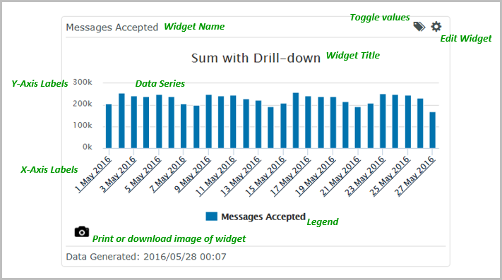
Similar to any graph, a widget consists of numerous components, including the dots, lines or bars representing data, the labels used for the Y and X axes, and the title. This sample widget shows the properties you can configure for a custom widget.
Widget setup
When you set up a widget, you start by selecting which style to use, such as bar, column, pie, or table. Depending on the style you select, the page displays the relevant settings. For example, for a pie chart, where you're looking at just one set of values, you'll see fewer properties than you will for, say, a scatter plot, where you're looking at two sets of values.
You can preview your widget while setting it up. The preview function uses the first 25 rows of data from the most recent report instance. Note that if the report has not run before, then the preview will not display any data.
Troubleshooting
Here are some common error conditions that can occur while working with widgets:
-
The widget is not compatible with the underlying report.
This can happen with existing widgets when you or someone else modifies the underlying custom report. If, for example, the widget uses a field that was removed from the report, then when you go to view the widget you'll see an error message saying the widget is no longer compatible with the report. You need to either change the widget to not use the field or change the report to add the field back in.
-
The widget doesn't display any data.
This typically happens when you base a widget on a report that hasn't run yet. Either wait for the report to run or locate the report, select the More Actions menu, and then select Run Now.
-
You try to add a widget and see the message saying the dashboard is full.
Widgets using the List type are not highly visible, so look carefully to make sure they're aren't any 'lying about'. You can also free up space by moving a widget to another dashboard.
-
Widget preview is not available.
This can happen when the widget is based on a report that hasn't run yet. Locate the report and select the More Actions menu, then select Run Now.